Easy Teacher Score Charts for Data Assessment
In my years as an educator, one truth has remained consistent: teaching is as much about understanding our students as it is about delivering content. As teachers, we’re inundated with data – from class tests, state assessments, national comparisons, and everything in between. But how often do we feel overwhelmed by the sheer volume of numbers and statistics? The answer, at least in my case and many colleagues I’ve spoken to, is “far too often.” That’s where the importance of data assessment becomes evident.
Data assessment isn’t just about collecting scores; it’s about translating those scores into meaningful insights that can guide our teaching strategies. By understanding where our students stand, we can tailor our lessons to meet their unique needs and help them reach their full potential. Yet, as critical as this process is, it doesn’t have to be complicated or time-consuming. This is where score charts come into play.
Imagine having a visual tool that not only simplifies the sea of numbers but also offers actionable insights at a glance. That’s the power of a well-designed score chart. Using score charts can drastically reduce the time and effort required to make sense of student data. Moreover, they empower us to make informed decisions about our teaching methods, ensuring we provide the best possible education for our students.
1. Understanding Different Scoring Systems
Navigating the realm of student assessments, I’ve often found myself puzzled by the myriad of scoring terms thrown around. It’s not just about “how much” a student scored, but also “how” that score was derived and “what” it signifies. Let’s simplify and understand some of these crucial scoring systems.
Scale Score Chart
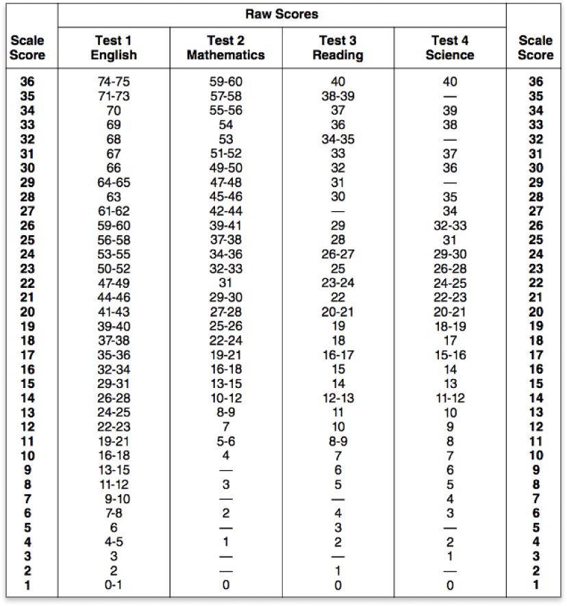
**This sample is from ACT. For more information, visit: https://www.ontocollege.com/act-scores/
When I first heard the term ‘scale score’, I was admittedly a bit confused. Is it not just a score on a scale? Well, not quite. A scale score is a conversion of a student’s raw score on a test or assessment to a common scale that allows for a consistent interpretation of scores. What’s beneficial about this is that it allows us to compare scores from different versions of a test from previous years, ensuring fairness and consistency.
But how is this different from a basic score, you ask? A basic score is often the raw number of questions a student answered correctly. It’s straightforward but doesn’t factor in the difficulty of different test versions or the comparative performance metrics.
Conversion of the Raw Score Chart
Now, let’s chat about the ‘raw score’. This term refers to the initial score achieved by a student, often calculated by tallying the number of correct answers. But as educators, we know the value of understanding more than just correct answers. We need to fathom the weight of each question and, sometimes, the penalty of wrong answers.
In many testing scenarios, especially standardized ones, raw scores undergo conversion to produce a more standardized or scaled score. This process can account for the difficulty level of questions or the differences in test versions. An important aspect to note is the impact of wrong answers. Some tests penalize for incorrect answers, detracting from the raw score. Understanding this nuance is crucial for us to gauge a student’s performance accurately.
Overall Score vs. Basic Score Chart
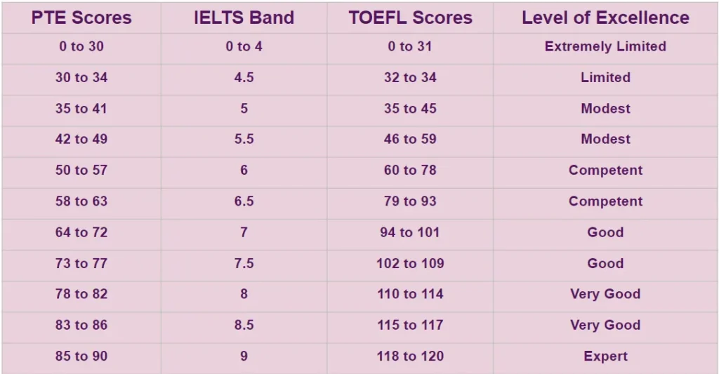
**In this example, the basic scores are converted into Level of Excellence. For more information, see https://www.collegedekhoabroad.com/articles/pte-score-chart/
Coming to one of the most frequent questions I’ve encountered (and admittedly asked myself in my early years): What’s the difference between an overall score and a basic score?
The overall score typically accounts for all sections or aspects of an assessment. Think of it as the holistic representation of a student’s performance, encapsulating every component of the test. On the other hand, the basic score, as we touched on earlier, is the direct tally of correct answers. While the basic score gives a snapshot, the overall score provides the full picture.
Understanding the distinction between these two scores is pivotal. While the basic score offers a quick insight into the areas a student tackled correctly, the overall score dives deeper, reflecting their strengths, weaknesses, and overall competency in the subject.
2. Delving into Subject-specific Assessments
While general scoring methods offer us a broad understanding of our students’ abilities, diving into subject-specific assessments is where the nuances come alive. Just as we tailor our teaching styles for each subject, it’s paramount that we adjust our assessment techniques and understand the unique metrics that come with them. Let’s break these down.
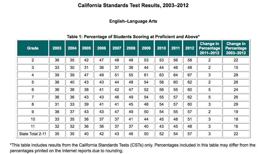
English Language Arts Score Chart
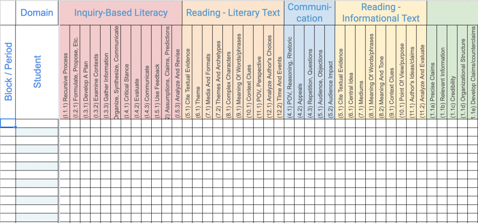
**This skills tracking Score Chart is very handy when considered different areas of teaching Enblish. For more, visit https://cultivatingthelearning.com/student-tracker/
Having taught English Language Arts for years, I recognize its unique challenges and joys. Unlike some subjects where answers can be clear-cut, English often ventures into the realms of interpretation and expression. So, how do we measure performance in such a dynamic field?
Key metrics for measuring student performance in English language arts often include comprehension, vocabulary usage, grammatical accuracy, and writing structure. Moreover, one can’t ignore the elements of creativity, critical thinking, and the ability to articulate thoughts cohesively. Visualizing these metrics on a score chart can help pinpoint areas of strength and those that need more attention.
Classroom Assessment Scoring System for Special Education
Special education is close to my heart, a field that requires immense patience, understanding, and specialized teaching techniques. But with these tailored teaching methods come tailored assessment techniques.
The emphasis on special education cannot be understated. Students here have unique learning styles and capacities, which means the conventional assessment yardsticks might not always apply. Instead, the Classroom Assessment Scoring System (CLASS) for special education often looks at factors like engagement, adaptability, and response to interventions.
How the assessment scoring differs from regular assessments is essential to understand. Traditional grading scales may not apply. Instead, progress could be measured in milestones, behavioral changes, or even the ability to apply learned skills in practical scenarios.
Constructed-Response Assignments Score Chart
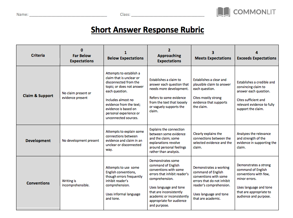
**Sample rubric from https://www.commonlit.org/en
We’ve all handed out assignments where instead of ticking boxes or choosing from multiple choices, students have to construct their responses – be it essays, short answers, or project descriptions. These constructed-response assignments are invaluable as they push students to think, reason, and articulate.
The importance of constructed-response assignments lies in their ability to gauge depth of understanding, critical thinking, and clarity of expression. Instead of just recalling information, students need to apply, analyze, and sometimes even evaluate or create.
Scoring these can be more intricate. Scoring guidelines typically involve rubrics that account for content accuracy, coherence, structure, and sometimes even originality. It’s also important to classify these scores into student performance categories like “Exceeds Expectations,” “Meets Expectations,” “Approaching,” and “Needs Improvement,” to give a clearer picture of where the student stands.
3. Broadening the Scope: School-wide and National Assessments
In the world of education, while classroom-specific assessments are invaluable in gauging a student’s day-to-day progress, there’s a larger picture we must consider. To understand the true impact of our teaching and the overarching performance of our students, we often look towards broader metrics – those that span across schools, states, and even the nation. Let’s journey into this expansive arena.
Public Schools vs. National Assessment of Educational Progress (NAEP) Score Chart
Throughout my teaching career, I’ve often been asked about the larger context of student performance. How does our school or district compare on the national stage? That’s where assessments like the NAEP come in.
Overview of scores from public schools: Public schools across the nation have a range of students, each with their unique backgrounds, strengths, and challenges. Scores here reflect not just individual performance but also the cumulative impact of teaching strategies, school resources, and community involvement.
How they compare to the NAEP: The National Assessment of Educational Progress, often dubbed ‘The Nation’s Report Card’, is a comprehensive tool that evaluates educational outcomes on a macro level. When we juxtapose public school scores with NAEP results, we gain insights into how our collective educational endeavors measure up on a broader stage. This comparison can shed light on areas where we excel and others that might need more attention, not just at a classroom level but also in terms of curriculum planning, resource allocation, and pedagogical strategies.
State Assessment vs. National Assessment Score Chart
Just as individual health forms the bedrock of community well-being, individual school performance contributes to state and national educational standards.
Differences and similarities between state and national assessments: Each state often has its curriculum, goals, and assessments tailored to its population’s unique needs. While state assessments might zoom into specific areas pertinent to their context, national assessments like the NAEP provide a uniform measure to evaluate and compare educational outcomes across the states.
The intriguing part is the overlap. Many skills and knowledge areas, like basic arithmetic or reading comprehension, remain consistent. However, the depth, emphasis, or contextual application might differ.
The significance of performance level descriptors: Ever wondered what terms like “Proficient” or “Basic” mean on these assessments? Performance level descriptors provide educators, parents, and policymakers with a clearer understanding of what students know and can do. They are crucial yardsticks that help translate scores into actionable insights. For example, knowing that a significant portion of students is “Below Basic” in a particular skill area can inform curriculum adjustments, teacher training, and resource prioritization.
4. Tools and Measures for In-depth Assessment
Within the grand tapestry of education, while overarching assessments paint a broad picture, it’s often the intricate, detailed tools and measures that offer the richest insights. As educators, harnessing these can make our teaching endeavors not just effective but also precise and tailored. Let’s delve into some of these pivotal tools and understand their significance.
Number of Problems and Standard Deviation Chart
In the intricate dance of teaching and assessing, it’s not just about what students get right or wrong, but also how consistently they perform.
Analyzing the number of problems: This involves looking at how many issues or challenges students face across different topics or skill sets. For instance, if a majority of the class is struggling with a particular math concept, it could signal a need for revisiting that topic or adopting a different teaching method.
Understanding the dispersion using standard deviation: Remember those statistics classes? Here’s where they come handy! Standard deviation helps us gauge the spread or variability in students’ scores. A high standard deviation might indicate that while some students have grasped a concept thoroughly, others are lagging. Conversely, a low standard deviation suggests that most students are performing at a similar grade level, be it high or low.
Locally-Selected Measures vs. Classroom Observations Score Chart
As I often tell my fellow educators, sometimes the most potent insights come not just from numbers but from the very act of observing and interacting.
Distinguishing between measures selected at a local school level and those based on classroom observations: Local measures might include tools or assessments chosen by the school or district to gauge performance. They’re often standardized to some extent and reflect the broader goals of the institution. Classroom observations, on the other hand, are more organic. They involve watching students, understanding their dynamics, and gleaning insights from their behavior, participation, and interactions.
Lesson Plan and Student Learning Chart
Every lesson plan I craft is with one primary aim – to facilitate meaningful, impactful learning. But how do we measure its effectiveness?
Importance of aligning lesson plans with student learning outcomes: A lesson plan isn’t just a roadmap; it’s a promise of what we intend our students to learn. Aligning this with measurable learning outcomes ensures that we’re not just teaching, but students are imbibing and applying their knowledge.
Assessing student growth data: One of the most gratifying parts of being an educator is witnessing student growth – not just academically, but holistically. To measure this, we often turn to student growth data. This data provides insights into how a student’s performance evolves over time, highlighting areas of improvement and those that might require continued attention.
5. Reporting and Utilizing the Data
In my experience, the collection and analysis of assessment data is only half the equation. The real power lies in how we report, communicate, and ultimately utilize this data to enhance learning experiences. It’s the bridge between knowing and acting. With that in mind, let’s dive into the intricate art and science of reporting and leveraging assessment data.
Score Reports for Different School Years Chart
We’ve all felt it — that quiet pride when a student graduates from one grade to the next, a testament to their growth and our collective efforts. But beyond the emotional aspect, there’s valuable data that charts this journey.
Tracking student progress over different school years: The beauty of education is its continuum. By compiling score reports for different school years, we can visualize a student’s academic trajectory. This helps identify patterns, like consistent strengths or recurring challenges, enabling more targeted support.
Importance of test scores in these reports: While holistic development is essential, test scores provide a quantifiable measure of a student’s academic abilities. They serve as milestones, helping gauge the efficacy of teaching methods, curriculum adjustments, and intervention strategies. Furthermore, such scores often play a crucial role in certain decisions, like placement in advanced courses or the need for additional tutoring.
Student Performance Category and Descriptors Chart
As teachers, we know that a single number or grade often doesn’t do justice to the multifaceted nature of student performance. That’s where categorization and detailed descriptors come into play.
Categorizing student performance: By sorting scores into categories such as “Exceeds Expectations,” “Meets Expectations,” or “Needs Improvement,” we move beyond mere numbers to a more nuanced understanding. This categorical approach helps students, parents, and educators quickly grasp where a student stands in relation to set benchmarks.
Using descriptors to provide more detailed feedback: Imagine receiving feedback that not only tells you where you stand but also why and how you can improve. Descriptors are the words behind the grades, offering insights into specific areas of strength and opportunities for growth. They make feedback more actionable, guiding students on the next steps and areas to focus on.
Conclusion
Reflecting on our deep dive into the world of score charts and data assessments, it’s evident that the heart of these tools and metrics lies in their power to uplift the very essence of education. Each chart, each number, and each descriptor isn’t just data. It’s a story — a narrative of student growth, of our teaching strategies, and of the collaborative journey of learning.
Emphasizing the importance of these score charts for enhancing the quality of education: In our mission to provide top-tier education, these score charts serve as vital signposts. They help us pinpoint areas of excellence and opportunities for refinement. More importantly, they remind us that education is ever-evolving. Just as our students grow, so must our methods and approaches, evolving in tandem with the insights these charts provide.
Encouraging continuous assessment and adaptation based on these scores: One of the lessons I’ve cherished as an educator is the value of adaptability. Continuous assessment, using these charts, ensures we stay attuned to the dynamic needs and strengths of our students. But assessment without action is a missed opportunity. Every score, every observation, beckons us to adapt, innovate, and reimagine, ensuring we offer an educational experience that’s both enriching and empowering.
And before we part, a small yet crucial reminder: as you delve into the art of chart-making, don’t forget to include clear legends, scales, and data pointers. The easier our charts are to read and interpret, the more seamlessly they’ll integrate into our teaching methodologies, benefiting not just us, but our beloved students.